Choosing the right spirits bottle product supplier isn’t…
How to Choose the Right Liquor Bottle Color for Your Brand’s Personality
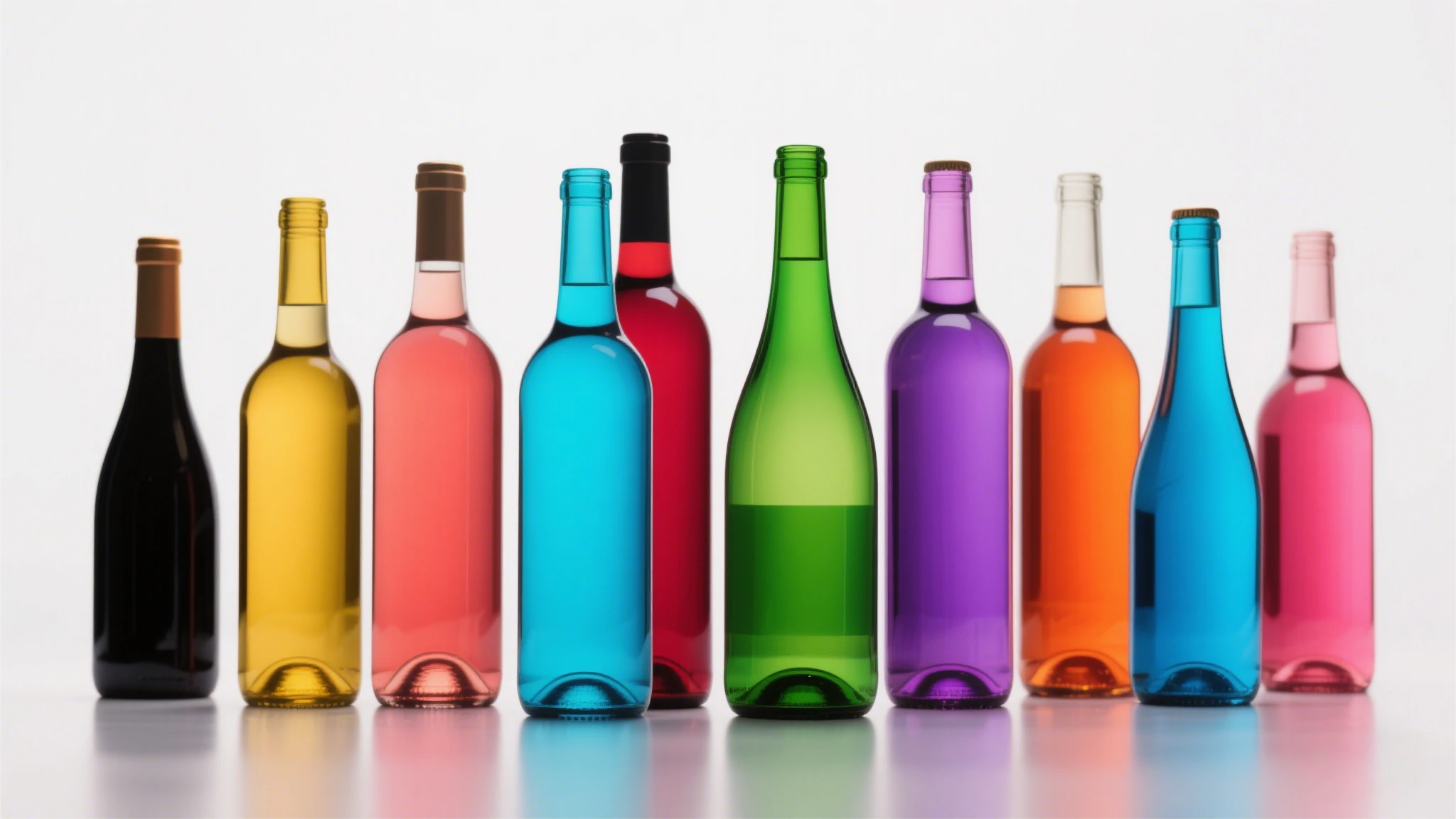
In the fiercely competitive spirits industry, a liquor bottle is more than a container—it’s a silent storyteller. Liquor Bottle Color, as one of the most visceral elements of design, wields immense power to shape perceptions, evoke emotions, and ultimately drive purchasing decisions. Selecting the right bottle color is not merely an aesthetic choice; it’s a strategic alignment of psychology, culture, market dynamics, and brand identity. Below, we delve into a comprehensive framework to help you choose a bottle color that amplifies your brand’s personality and stands out on crowded shelves.
1. Define Your Brand’s Core Personality
Every iconic liquor brand begins with a clearly defined personality. This identity serves as the foundation for all design decisions, including color.
- Luxury & Exclusivity (e.g., Louis XIII Cognac):
Keywords: Sophistication, heritage, craftsmanship.
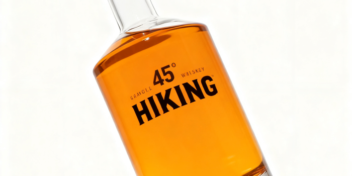
Color Strategy: Deep burgundy, black, or gold-toned bottles paired with intricate embossing or crystal finishes. - Adventurous & Bold (e.g., Johnnie Walker):
Keywords: Dynamism, rebellion, innovation.
Color Strategy: Stark contrasts like black bottles with metallic accents or vibrant reds to signal energy. - Eco-Conscious & Natural (e.g., Hendrick’s Flora Adora Gin):
Keywords: Sustainability, purity, authenticity.
Color Strategy: Earthy greens, recycled matte glass, or transparent bottles with botanical motifs. - Playful & Youthful (e.g., Skittle Vodka):
Keywords: Fun, whimsy, experimentation.
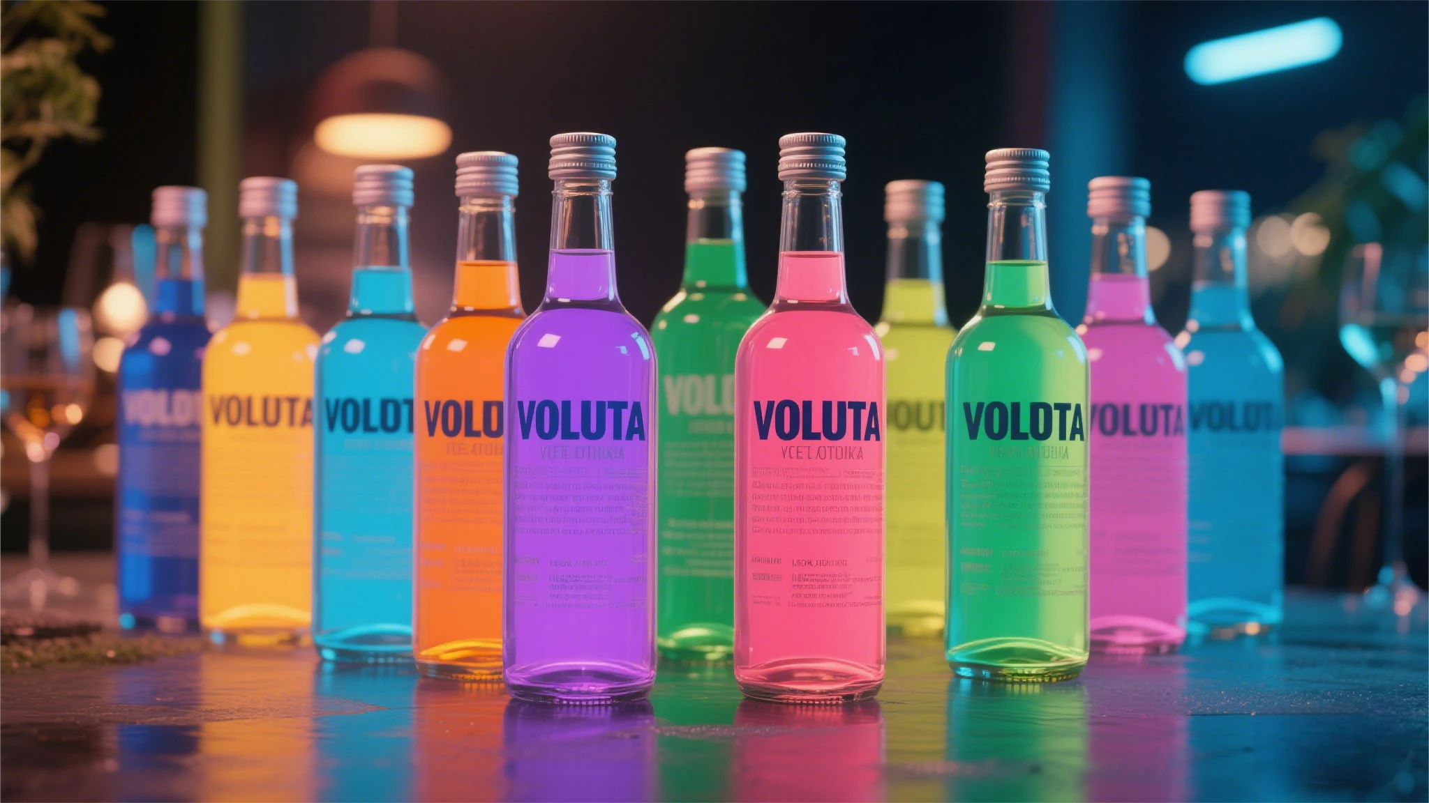
Color Strategy: Neon hues, gradient effects, or translucent pastels.
Action Step: Use frameworks like Aaker’s Brand Personality Model to categorize your brand into archetypes (e.g., “Sincerity,” “Excitement,” “Sophistication”) and map them to color palettes.
Liquor Bottle Color
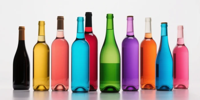
2. Color Psychology and Sensory Influence
Colors don’t just attract attention—they shape taste expectations and emotional connections. Scientific studies reveal:
- Dark Colors (Black, Brown, Deep Blue):
- Associated with luxury, mystery, and complexity.
- Data Point: A Journal of Sensory Studies experiment found whiskey in dark brown bottles was perceived as 23% “richer” than the same liquid in clear glass.
- Clear/Transparent:
- Signals purity and modernity. Ideal for vodkas or gins emphasizing distillation clarity.
- Risk: Overused in premium categories; may lack differentiation.
- Green:
- Evokes nature, health, and organic qualities.
- Case Study: Tanqueray Malacca Gin uses emerald-green glass to reflect its botanical ingredients.
- Red & Orange:
- Stimulate appetite and convey warmth. Often used for spiced rums or cinnamon-flavored liqueurs.
- Neuroscience Insight: Red increases perceived sweetness by 15% (Cambridge University study).
- Blue:
- Projects tranquility and trust. Popular for premium gins or vodkas targeting coastal markets.
- Sensory Trick: Testers described blue-bottled spirits as having “mineral notes,” even when the liquid was identical to other bottles.
3. Category Conventions vs. Disruption
While tradition guides many color choices, strategic disruption can create memorable differentiation.
| Category | Traditional Color Logic | Disruptive Innovation |
|---|---|---|
| Whiskey | Amber/dark brown (UV protection + maturity) | Macallan M’s transparent crystal bottle highlights the spirit’s natural hue, doubling its luxury appeal. |
| Vodka | Clear/light blue (purity) | Cîroc’s silver-frosted bottle mimics diamonds, aligning with nightlife glamour. |
| Tequila | Green (agave symbolism) | Casamigos’ amber bottle bridges tequila and whiskey drinkers by showcasing aging. |
| Gin | Clear/green (botanical freshness) | Malfy Gin’ lemon-yellow bottle screams citrus-forward flavor. |
Rule of Thumb: Balance 70% category familiarity with 30% innovation (e.g., textured glass, metallic caps).
4. Competitive Color Mapping
Analyze competitors to identify gaps and opportunities.
- Step 1: Collect color swatches of top competitors’ bottles.
- Step 2: Plot them on a matrix (e.g., “Traditional vs. Modern” and “Subtle vs. Bold”).
- Step 3: Identify underserved quadrants.
Case Study: Japanese whiskey brand Nikka chose forest-green bottles when competitors saturated the market with brown, carving a niche in premium gifting.
5. Practical Considerations: Science Meets Budget
- UV Protection:
- Amber glass blocks 90% of harmful UV rays vs. 50% for green and 0% for clear.
- Cost Implication: Clear bottles require UV-resistant coatings (+12–18% production cost).
- Production Costs:
- Standard Colors: 0.50–1.50 per bottle.
- Premium Finishes: Matte coatings (+0.80),metallicpigments(+1.20), custom molds (+$3,000 setup).
- Sustainability:
- Recycled glass often has slight tint variations—turn this into a storytelling asset (e.g., “Each bottle is uniquely imperfect”).
6. Cultural Sensitivity: Navigating Color Taboos
Colors carry cultural baggage. A misstep here can derail global ambitions.
| Color | High-Risk Markets | Solution |
|---|---|---|
| White | East Asia (funerals) | Use ivory or off-white with gold foil. |
| Red | South Africa (political) | Opt for deeper burgundy or maroon. |
| Black | Middle East (mourning) | Pair with gold accents for luxury. |
Pro Tip: Avoid animal imagery in Islamic markets; opt for geometric patterns.

7. Future Trends: Sustainability and Tech-Driven Customization
- Eco-Innovations:
- Algae-Based Dyes: Brands like Silent Pool Gin use biodegradable pigments.
- Laser Etching: Replaces chemical inks, ideal for matte black bottles.
- Digital Interaction:
- AR-Enabled Bottles: Absolut’s limited editions let users scan labels to unlock color-changing filters.
- Personalization: Coca-Cola’s “Share a Coke” approach adapted for liquor—e.g., limited-run regional colors.
8. Testing and Iteration: From Lab to Shelf
- A/B Testing:
- Virtual Shelves: Tools like Nielsen Brandbank simulate how bottle colors perform online.
- In-Store Experiments: Partner with retailers to test two colors in matching markets.
- Failure Example: A craft beer brand’s shift to neon pink bottles alienated 40% of male customers who associated the color with “cloying sweetness.”
The Decision Framework: 5 Steps to Your Perfect Bottle Color
- Articulate Brand DNA: Use workshops to distill personality keywords.
- Audit Competitors: Identify color white spaces.
- Shortlist Culturally Safe Colors: Vet with local experts.
- Prototype and Price: Balance aesthetics with production feasibility.
- Validate: Test in controlled environments before full launch.
Conclusion: Color as a Strategic Superpower
Choosing a liquor bottle color is a blend of art and science—a decision that demands equal parts creativity and rigor. By anchoring your choice in brand psychology, cultural intelligence, and market insights, your bottle becomes more than packaging; it becomes a tactile embodiment of your brand’s soul. In an industry where 70% of purchase decisions are made in-store, the right color doesn’t just catch the eye—it whispers your story, one shade at a time.
Related Posts