Choosing the right closure for your Custom 750ml Glass…
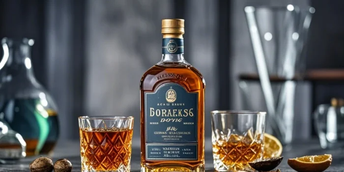
Craftsmanship in a Bottle: The Finest Whiskey Label Designs
Craftsmanship in a Bottle: The Finest Whiskey Label Designs
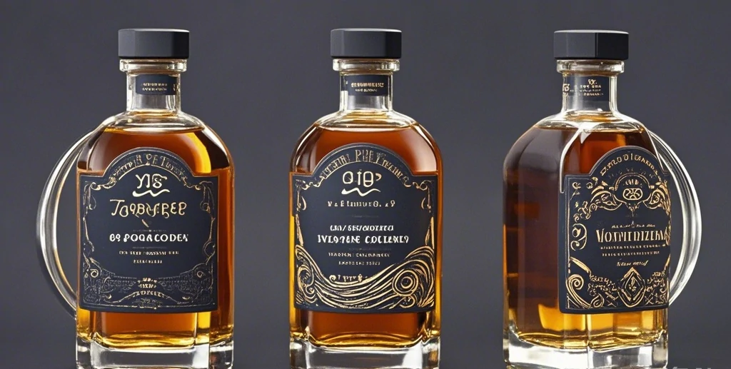
Whiskey isn’t just a drink; it’s a statement, an experience, and a legacy wrapped in tradition. And nothing encapsulates this better than the label adorning each bottle. A well-designed whiskey label does more than just name the brand – it tells a story, evokes emotion, and signifies quality. Let’s delve into the world of whiskey label design and explore what makes the finest ones stand out.
1. Historical Elegance
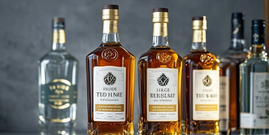
Many of the best whiskey labels draw inspiration from the past. Classic fonts, intricate illustrations, and vintage color schemes remind consumers of the rich history and tradition behind each sip. Brands like Macallan and Glenfiddich utilize this to convey their deep-rooted legacies.
2. Minimalistic Modernity
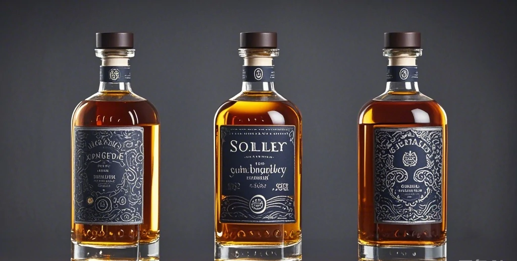
While tradition holds its charm, modernity has its own appeal. Labels that embrace minimalistic designs, with clean lines and simple color palettes, speak to a younger, more contemporary audience. Brands like Bulleit Bourbon have mastered this art, combining modern design with a touch of ruggedness.
3. Artisanal Craftsmanship
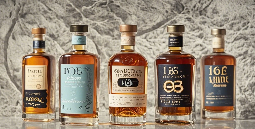
Intricate details and handcrafted touches often find their way onto premium whiskey labels. Whether it’s embossed lettering, hand-sketched images, or unique shapes, these elements add a tactile and visual richness that screams craftsmanship. The Dalmore, for example, uses its iconic stag emblem in a three-dimensional format, emphasizing the brand’s luxurious nature.
4. Storytelling Elements
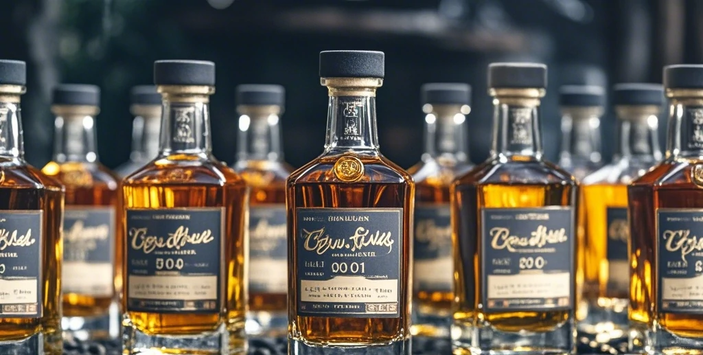
Every whiskey has a story, and the label is the first chapter. Whether it’s the origin of the ingredients, the history of the distillery, or the unique distillation process, good labels often incorporate these narratives. Balvenie’s labels often highlight the unique aspects of their production process, making each bottle part of a larger narrative.
5. Bold Experimentation
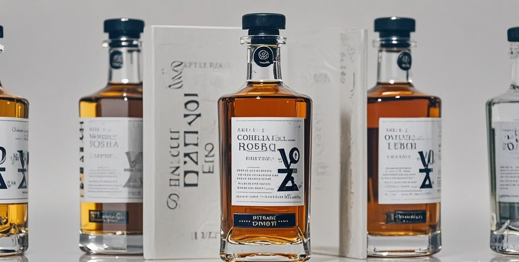
Some of the most eye-catching whiskey labels are those that dare to be different. Bold colors, unconventional shapes, and avant-garde graphics can make a bottle stand out on the shelf. Brands like Compass Box are known for their innovative and often artistic label designs, appealing to the adventurous whiskey drinker.
6. Cultural References
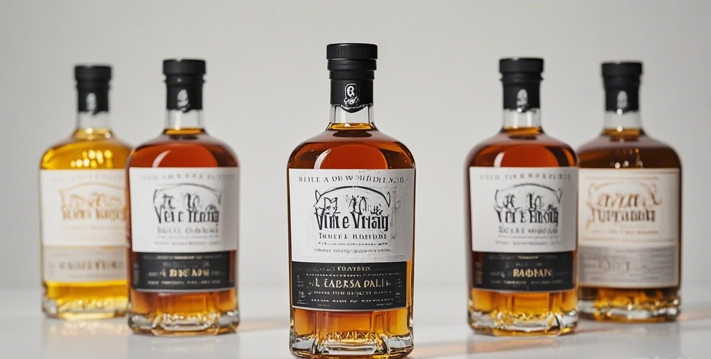
Incorporating cultural elements can also be a powerful tool. This could be local folklore, traditional symbols, or regional artistry. Japanese whiskey brands like Hibiki often use traditional Japanese symbols and motifs on their labels, creating a strong cultural connection.
7. Luxury Materials
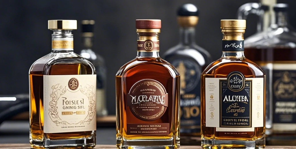
The material of the label itself can make a significant impact. Using premium materials like textured paper, foils, and metallic inks can instantly elevate a whiskey’s perceived value. Johnnie Walker’s Blue Label uses such materials to distinguish its premium product line.
Conclusion
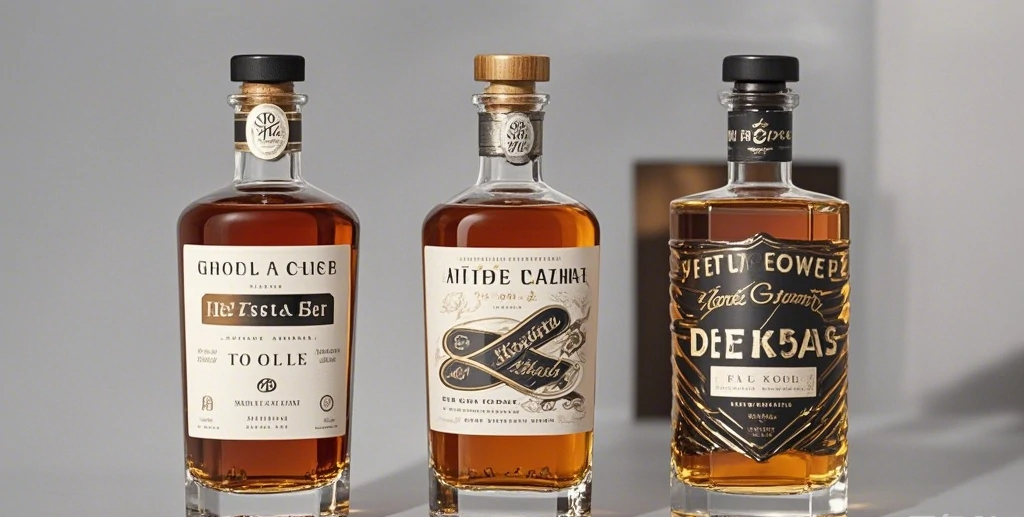
A whiskey label is more than just a pretty face; it’s a canvas that communicates the essence of the whiskey inside. From historical elegance to bold experimentation, the finest label designs balance aesthetics, storytelling, and craftsmanship. They invite the consumer not just to drink, but to experience and savor every detail. So, next time you pick up a bottle, take a moment to appreciate the artistry behind its label – it’s a preview of the craftsmanship within.
Cheers to the art of whiskey!

